Saturday, May 1, 2010

In a flurry of ideas


Image my own, used as pattern research


ok so i know i said i hated blogging, but i feel an urge to.i've had creative ideas left right and center.but no energy or time to start or finish or anyhting in between.

so i was looking online the other night, as i do most nights, when study gets a bit tedious.and came across an artist that by observation draws in biro and felt pen only in red, blue,yellow black and with the clever use of white space. creates images that have a contrast of detail and basic structure all in one, with a bit of pattern thrown in there.


I cant seem to find much about this artist, because anything i find is in another language....darn it.
Yet...one must gaze upon these illustrations and feel the inspiration i do:)

In responce to these images i was lead to draw, so i pulled out my biro and printed off an image i had taken of myself to grid up as a start.did that and my blank peice of paper and i was set.

Here are some various versions of my exploration.
I went and scanned clothing of mine that were patterned, so i had something to work with.
This is an image i took mid 2008 on the topic of isolation.
i like it for its texture and perspective, the mood in the clouds.
i plan on doing an illustration from this but at the moment i only have an outlined drawing. think it has potential for usage of patterns.


Now the image ive really explored with at the moment is this one.


this one was done with felt pen.


Then i scanned it into photoshop and really played around with blend modes and colors layers of the orignal drawn version of the image and photographic combined


I re-assessed my tool of choice and the manner of stroke.
so i used biro and got a finner detailing on the hair.


I then finished off the rest of the outlining of the image,and printed off an a4 size image of a floral pattern i scanned earlier.
chopped it into shape, and pasted it on as the sweater pattern, instead of drawing it in the meantime.
i plan to experiment with drawing patterns, floral, tartan textured later.
I then wished to add some color, and so didn't want to go overboard, picked my favorite combo, Cyan, magenta yellow.

I sectioned my image into three, then printed off the three images, and used one of those three colors to color each subtly. until i decided where to go next,which will be working on an idea for background of the image, rendering the eyes, and maybe adding some shadow, to make it pop.


Saturday, April 24, 2010

A tad of color


As part of an assignment at art school, a lead on from my photographic experimentation.
I had a few ideas sprout, and felt inspired, not by anyone but by my un-used water colors.
I dont use water colors often and when i do its always on top of acrylics, never by themselves.

I took images from the digital collection for my "room" assignment that i had posted about previously, and edited them to show basic outlines, with a bit of texture. printed them out then attacked them with watercolor paint.Their just the beginnings, or more simply the experimentation of what i might do, as these are just A4 size.
Would also like to see if i can portray different fabrics just using water color.

so in the meantime, here are my working images.


Monday, April 19, 2010

Brought to you by the color green, feat the word adore


Recently i decided to clean out anything i dont wear or use anymore or at all in some cases.
and i decided that i love this green hello kitty necklace i've had for a while, brought from some cheap dollar store, the green color of it attracted me instantly, tacky as it is, sometimes ya just love things no matter how bad they kinda are.

now im not into big loud necklaces but i couldn't resist it.
since buying it, i have then never worn it, just adored it.kinda defeats the purpose of buying it in the first place.
so in effort to wear or use everything i decided it was to stay in my inhabitancewhere i will love it enough to wear it.As my orignal plan saw.i can sense my obsession for green re-emerging.
so on that note here are a couple pairs of earrings i want to make more use of, or just adore to get the use out of having them.usually they hang off my roughly 40cm tall fabric mannequin torso.


love butterflies, had these for years, their fimo earrings, so tiny, too delicate to wear as my excuse, but they have the cutest white
box i keep them in, like specimens.

these earings are delicate also, like shell, brought from the same place as hello kitty.
never worn them, never been into big earrings.

back in the day, gosh that sounds so old of me, as i was saying, back in the day, i used to be rather fanatic of green, apple green, mint green and lime green to be more precise.
which is why i named my blog "Mintmannequin".
ive only just started up my blog, but ive used Mintmannequin for 4 years as an alias.
back then when i came up with it i had green in my hair which i miss.
but so many people do it now days i feel i cant.


Friday, April 16, 2010

My wonderland in black and white


Two weeks ago i was given the task at art school to choose a room in my house/flat, i am to investigate it by drawing, documentation, take photos silhouette, frottage, writing ect, any form that allows me to explore the rooms "character".so my room, i guess on obsevation it is filled with many textures, clowns, masks and fabrics, butterflies and books.
kinda has the 'wonderland' feel to it, so i now call it my wonderland, for project reasons.
i took a set of photos in digital form first to see what works and what doesnt, and i think what works best for this is the macro, or closer than that portrait format, to really zoom in on the pieces in my room really breaks it down to what its all about.

Then i tried black and white film, fomapan, so i could get the raw light that film captures and digital lacks.
Though the light isn't even in my room, so when i did do full room shots they tend to come out dark in some corners and mysterious, which unknowingly added to the character i was trying to emphasis.

Its still very much work in progress.

This set are all digital


The next few are from my black and white film, images i processed and scanned.

this one is a photogram
i get more satisfaction from black and white film than bright and colorful digital, although digital is useful, im no prude, but nothing compares to developing film and turning out your own images.
Photography is defiantly my outlet.
comments and opinions on my images are welcome:)

Next time i hope to have some drawings worthy of sharing.


Wednesday, April 14, 2010

Through rose tinted glasses


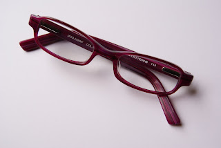
It appeared to me that i have been feeding my slowly growing obsession for rose, flamingo or berry pink.now i don't know when this started, maybe it was two yrs ago when i found out i needed glasses, and the only frames i liked in my budget at the time were black or berry.and due to a friends input, i choose the rose/berry colored frames, and quite frankly i liked them anyway.
since then i have worn them on and off, when migraines and headaches come, or during lectures, or when i really have to concentrate.though i fail at remembering to take them with me, everywhere.


my point is, iv'e never really liked pink, and always choose against it, if i had a choice.
finding the origin of my current obsession proves fruitless.
so why am i now tickling my world pink? who knows, but i like it, i think.

I took a few items of mine from my wardrobe to pink dye couple days ago, and its been fun.
Even the editing and enhancing of my first street photography project incorporated this currently unavoidable hue.
i will go into detail about my first street photography experience in a later blog.

but at this time i wish to share the rosy world mine seems to be at the moment.

firstly the fun i had with dye...

i might very well be the only one with an oversized cardigan in this bright magenta color.


This t-shirt i had'nt worn in months, was an ugly to be honest, due to its white color, now though being almost fluro pink, im not sure it was an improvement.


This floral T-shirt was recently brought from cotton-on, grey originally with pink and purple florals i decided to submerge it in the soup too.kinda like it with tights. though its very busy and PINK.

Thankfully my wardrobe is more about the black than anything else

And these chucks, Kaki green and baby pink, to what i would describe now as berry green, because of the color, its neither green nor berry, They are more striking in real life.


And the simple things that make my day smile.

This little cat ornament was purchased from a local second hand shop for just 50 cents, couldn't resist it.


These cushion covers....i brought five months ago from yaks and yetis. love throwing orange in with pink, ever since i saw a film called wasabi.if you haven't seen it do so.


The Rubix cube, even though i have the power to solve it, i have written instructions given to me that are proved to work, i still cant complete the last steps of 6 to 8 , though it still makes me smile.
this is a picture i took a couple weeks ago, under bad lighting, at night, and funny enough the pink tint i added to it seem to work in my opinion.
My duvet cover pattern inspires me to paint a canvas with a similar design, colors are great and wow, look Pink,....Again.

so anyway, the more i notice the more its everywhere, that dreaded pink color.just as well though, it kinda makes for happier winters looming days.